Negative Space Is the Most Expensive Thing in Your Room
Negative space is the strongest free move in room design. A stylist on why what you leave out decides how a home feels, and how to edit like one.
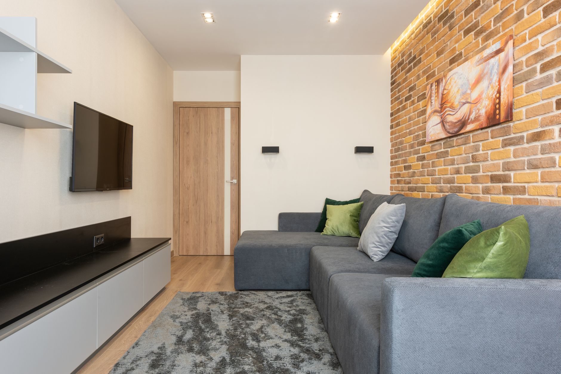
The most expensive looking thing in any room I've ever styled is empty space, and it costs nothing. Last October I shot a listing in Presidio Heights where a $4,200 walnut console had disappeared under 23 objects. I counted. Then I stripped it down to a plaster lamp and one ceramic bowl, and the photographer's before and afters looked like two different apartments. That gap between the lamp and the bowl did more for the room than anything the sellers had bought in a decade.
Galleries figured this out a century ago. A painting with four feet of white wall around it reads as important, and the same painting in a salon hang reads as inventory. Your living room works on the identical principle, which is why the rooms that photograph best are usually the ones where somebody had the nerve to stop.
Your Eye Is Doing Math You Never See
Negative space is not the absence of design. It's the part of the room that tells your eye where to land. When a sofa sits against a bare wall, that wall is doing active work, framing the sofa the way a mat frames a print. Fill it with a gallery of small frames, a leaning mirror and two sconces, and the sofa becomes one more item in a list.
There's real science under this. Researchers at the Princeton Neuroscience Institute showed in a 2011 Journal of Neuroscience study that objects in a crowded visual field compete for your brain's limited processing capacity and actively suppress one another. When everything in a room asks for attention, nothing receives it. Your $3,000 armchair and a $12 candle end up neurologically equal.
So the question is never what to add. It's what to protect.

The Edit I Run Before Every Shoot
When I test a room before the camera comes out, I remove roughly a third of what's on every surface and put it in a box in the hallway. Not the best third or the worst third... just a third. Then I stand in the doorway, because that's where a room makes its first impression, and I put back only what I actually miss. Most of the box never returns.
The stakes go beyond photography. A 2010 study in Personality and Social Psychology Bulletin tracked 60 spouses in dual income Los Angeles households and found that the women who described their homes in cluttered, chaotic terms showed flatter cortisol recovery across the day, a stress pattern tied to poorer long term health. Your body keeps reading a crowded room long after your taste has gone blind to it.
What to pull first, in order:
- Small decorative filler under ten inches tall that you never chose on purpose
- Anything whose origin you can't name within five seconds
- The second and third of any duplicated function, two trays, three vases
- Single small frames scattered one per surface, which read as static, not sentiment
Where Bare Goes Wrong
The common mistake is confusing negative space with minimalism, and they're different disciplines. Minimalism is about owning less. Negative space is about spending emphasis, and you can run a richly layered room on it, one saturated wall, a big patterned rug, then restraint everywhere the pattern needs room to breathe. I've styled English country rooms holding sixty objects that still felt calm because the sight lines stayed clear.
I'll admit the doctrine has limits. My friend Dana took my advice a little too literally last spring and stripped her dining room to a table, six chairs and one pendant, and honestly... she ate at the kitchen counter for three weeks because the room felt like the waiting area at a nice dentist. We put back a rug, a lamp on the sideboard and a stack of her genuinely ugly cookbooks, and the room worked again. I'm not 100% sure the full strip suits every person or every room, and I say that as the one who lectured her into it.
Empty only reads as intentional when what remains has presence. A single object with real weight, the kind I wrote about in the quiet confidence of a considered room, can carry a bare surface alone. A sad diffuser cannot. Negative space flatters good objects and exposes weak ones, which is exactly why people resist it.
Space Is a Luxury Signal, So Spend It Like One
Walk any five million dollar listing and count the objects. You'll run out slowly. Wealth in interiors stopped announcing itself through accumulation some years back, a shift you can see even in this June's roundup of the most notable home design innovations, where the strongest launches were quieter than their categories. Guests read openness the same way buyers do: somebody here didn't need to fill this.
And here's the part nobody markets... editing is free. In my experience, the difference between a room that feels styled and one that feels stuffed is rarely a purchase. It's the removal of somewhere between eight and fifteen objects. Put the money you didn't spend into one piece with real scale, a lamp that feels slightly too big, art roughly 40 percent larger than feels safe. Scale plus space beats quantity every time.
But leave the walls alone for a month first. Rooms tell you where they want weight once they can breathe.
Tonight, take the most crowded surface in your home down to nothing, then put back exactly one object, plus a lamp if the spot needs light. Box everything else, tape it shut, and write a date seven days out on the lid. Whatever you haven't retrieved by that date goes to donation, and the surface stays at one. That single cleared plane will change how the entire room reads by morning.
The Salon
Frequently asked questions
Is negative space the same thing as minimalism?
No. Minimalism is about owning fewer things, while negative space is about where you spend visual emphasis. A layered, colorful room can use negative space well as long as key sight lines and surfaces stay clear enough for the eye to rest.
How much of a room should actually be left empty?
There's no fixed ratio, but a working target is to keep about a third of your surfaces and wall area clear. Stand in the doorway and check where your eye lands first; if it can't settle anywhere within a second or two, remove more.
Won't negative space make my home feel cold and unlived in?
Only if what remains lacks weight. Pair cleared surfaces with one or two objects of real scale and texture, plus warm layered lighting, and the emptiness reads as confidence rather than vacancy.