Living Coral Is 2019's Color, and Most Rooms Can't Carry It
Pantone's 2019 Color of the Year, Living Coral, works beautifully in small doses. A decor editor on where it lives well in a home and where it fails.
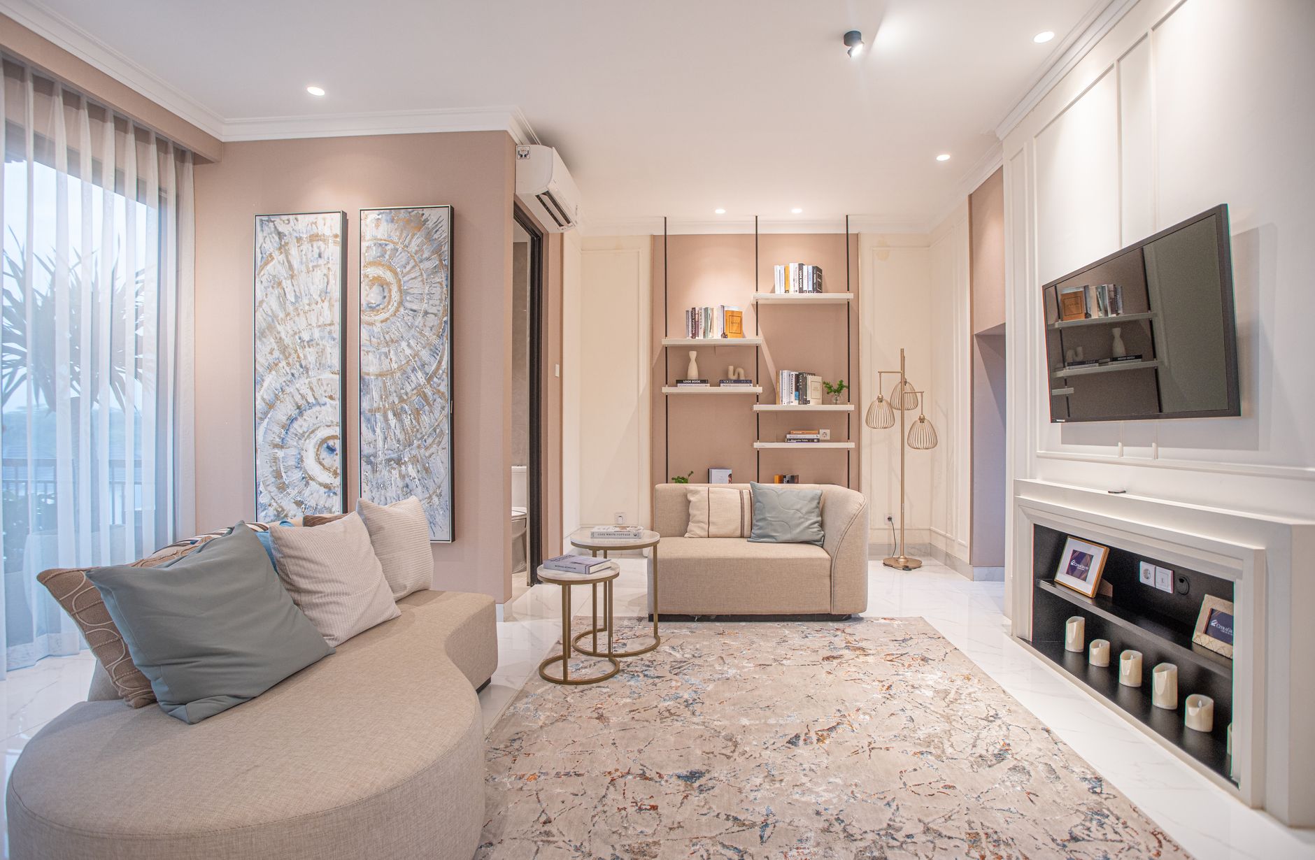
Pantone's 2019 Color of the Year, Living Coral, is a gorgeous color that belongs in your home in small, deliberate doses, and almost never on all four walls. I learned that the expensive way this February. A client in Westchester wanted her powder room in it, so we had the paint store scan the Pantone chip, and by 4 p.m. on the first afternoon the north light had turned those walls the exact shade of canned salmon. We repainted nine days later, and I paid for the second coat myself.
So here's my position, and I'll defend it for the rest of this piece. Living Coral is an accent color that the press keeps selling as a wall color. It looks wonderful on a phone screen and in a styled vignette. Inside a real room, with real light moving across it from morning to dusk, it gets much harder to live with... and that gap tells you a lot about how trends reach our homes this year.
What Pantone Announced, and Why People Argued About It
Pantone named PANTONE 16-1546 Living Coral on December 6, 2018, describing it as an "animating and life-affirming coral hue with a golden undertone." You can read the full framing on Pantone's official site. It follows Ultra Violet, which very few people painted anything, and it lands right as millennial pink starts to feel tired. The timing makes sense. Coral is pink's warmer, more grown-up cousin.
The pushback came quickly. Critics pointed out that naming a color after living coral, while real reefs are bleaching white from warming oceans, felt tone-deaf. Pantone said the choice was partly meant to draw attention to that. I'm not sure the explanation lands, but it did keep the color in the headlines well into January. For more on this, see The Week's Top 7: Most Notable Home Design and Real Estate Innovations Right Now (June 07, 2026).
But the design trade's reaction was quieter and more practical. Every showroom I walked through at the January markets had coral somewhere. Very little of it was on the walls.
Why Living Coral Photographs Better Than It Lives
Coral is a screen color. On a backlit display it glows. On drywall it absorbs whatever light you give it, and a warm color with a golden undertone pushes orange in low or cool light and goes flat under cheap LED bulbs. That's what happened in Westchester. The chip looked like a sunset. The wall looked like lunch.
I've seen this pattern with every Color of the Year I've styled around. The color gets chosen for how it reads in a campaign, then homeowners try to scale it up to 300 square feet of wall. Saturation that feels joyful on a throw pillow can feel loud across a whole room, especially when you're in it every day at 7 a.m. with coffee and no patience.
The light test I now insist on
Paint a sample board at least 2 feet square. Move it to three different walls over two full days, and look at it at dawn, midday and after dark with your actual bulbs on. If you still love it on day two, you can talk about walls. Most people don't. For more on this, see The Week's Top 7: Most Notable Home Design and Real Estate Innovations Right Now (May 29, 2026).
Where Coral Earns Its Place in a Room
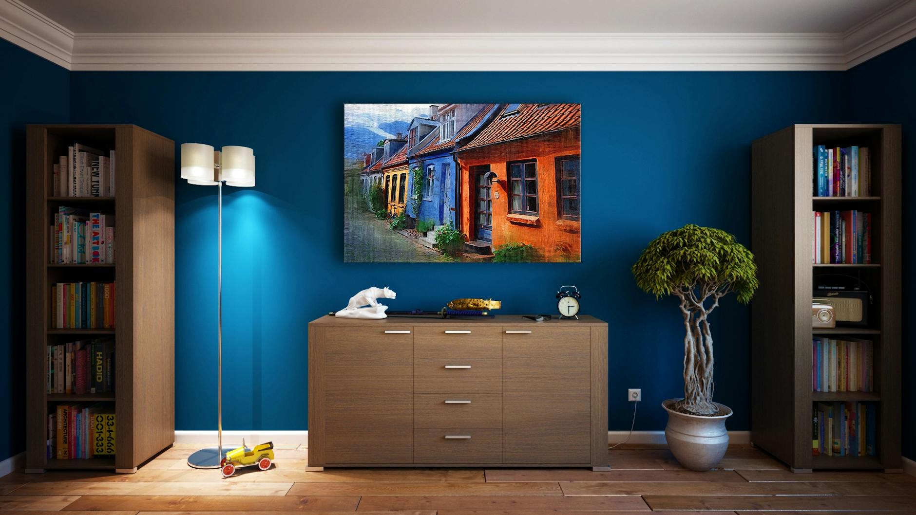
Used with restraint, this color is lovely. It warms grey rooms, flatters skin tones and plays beautifully against deep green, navy and aged brass. The trick is keeping it to surfaces you can swap for under $200 when you tire of it.
- Textiles first: a linen lumbar pillow, a bouclé ottoman or a mohair throw at the foot of the bed.
- Glazed ceramics: a single large lamp base or a cluster of vases on a console reads as intentional, not trendy.
- The inside of something: the back of a bookcase or the inside of a closet door gives you a surprise without committing the room.
Now the looser confession. My friend Dana painted her entire bedroom in a coral very close to this one in January, after one glass of wine and a long read of the press release. I told her it was a mistake. Honestly? It looks pretty great, because her room faces south-west and she has a dark walnut bed that calms everything down. So I'm not 100% sure my rule holds for every room. It might just hold for every room I've personally been paid to fix.
What This Means If You're Renovating or Selling in 2019
People are spending real money on their homes right now. The 2019 Houzz & Home Study put the median renovation spend among Houzz users at around $15,000 for projects in 2018, a jump from the year before. With that kind of budget on the line, you shouldn't put a trend color into anything permanent: tile, cabinetry, countertops, a bathtub. Coral tile you love in 2019 is coral tile a buyer prices as a demolition job in 2024.
If you're listing a home, the case is even simpler. Agents and stagers I work with still bring warm whites and soft greiges to the walls and add color through objects that leave with the furniture. The National Association of Realtors' research on staging keeps finding that buyers struggle to picture a home as theirs when the decor is very personal. A coral accent wall can read as personality to you and a weekend of repainting to them. For more on this, see Zillow's 3D Home Tool Hit 2019 and Nothing Sold the Same Way Again.
There is a fair counterargument. Some stagers say one confident color makes listing photos stand out in a feed full of beige. I've seen it work in a city apartment with great light. I've also seen it backfire in a dim suburban den. Your light decides, not Pantone.
This weekend, buy one coral object you can return or replace for under $50, like a pillow cover, a small vase or a stack of linen napkins, and live with it in your main room for two weeks. If you keep reaching for it, add a second piece in another room. If it starts to feel loud by day five, you've saved yourself a gallon of paint and a very orange powder room.
The Salon
Frequently asked questions
What colors go with Pantone Living Coral in a home?
Deep greens, navy, charcoal and warm whites all work well with it, and aged brass or walnut keeps it from feeling sugary. Stay away from pure bright white, which can make coral look orange and flat.
Should I paint my walls Living Coral?
Only if the room gets strong, warm light and you've tested a large sample over two full days. In most rooms it works better on textiles, ceramics or the inside of a bookcase, where you can change it cheaply.
Will a coral accent wall hurt my home's resale value?
It probably won't lower the price, but it can put buyers off and you'll likely repaint before listing. Neutral walls with color in removable decor are the safer staging choice.