Paint Colors That Actually Photograph Well in Real Estate Listings
Interior designer and property investor Olivia Grant on choosing paint colors that look great in listing photos and sell homes faster.
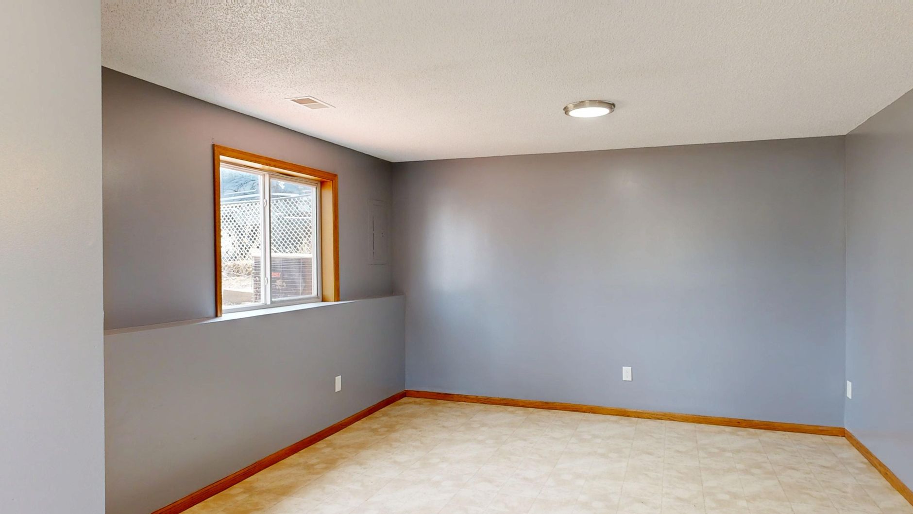
Interior designer and property investor Olivia Grant on choosing paint colors that look great in listing photos and sell homes faster.
Interior designer and property investor Olivia Grant on choosing paint colors that look great in listing photos and sell homes faster.
Why Camera Sensors Punish Certain Colors
Digital camera sensors, including the ones in professional real estate photography rigs, handle color differently than your eye does. Your brain corrects for warm evening light, for shadows, for the glow coming off a hardwood floor. A camera captures a moment and interprets it through white balance settings, aperture, and dynamic range. Colors in the yellow-orange spectrum tend to read warmer and more saturated on camera than in person. Cooler colors, especially mid-tone grays and certain blues, often lose their character entirely and flatten into something that looks like the wall just gave up.
The colors that photograph most reliably well sit in a specific tonal range. Think soft whites, warm greiges (that gray-beige middle ground), muted sage greens, and pale, chalky blues with enough white in them to stay bright. These colors hold their value in varying light conditions. They read as intentional rather than accidental. And they give the photographer something to work with rather than fight against.
According to a 2021 study by Zillow, homes with certain paint colors sold for measurably more than comparable homes with different colors. Specifically, homes with light blue or soft gray-blue bathrooms sold for around $5,400 more on average than homes with white bathrooms. That's not a decorating preference. That's a data point about how buyers respond to photographed color at scale.
The Specific Whites and Neutrals Worth Trusting
Not all whites are equal on camera, and this is where I see sellers make expensive mistakes. Pure, bright white, especially anything with a blue undertone, will blow out in well-lit rooms and look cold and clinical in rooms that don't get much natural light. It's unforgiving. When I tested Benjamin Moore's Chantilly Lace against Sherwin-Williams' Alabaster on a north-facing bedroom in a flip I was prepping in 2022, the difference in the final listing photos was striking. Alabaster, which has that slightly warm, creamy undertone, photographed like a room someone actually wanted to be in. Chantilly Lace looked like a hospital corridor.
Warm whites and off-whites with yellow or pink undertones tend to photograph with life. Greiges like Agreeable Gray (Sherwin-Williams) and Pale Oak (Benjamin Moore) have become almost default choices for a reason. They're not exciting. But they don't fail on camera, and in real estate photography, not failing is genuinely valuable.
The one area of real debate is whether greige has become so ubiquitous that it no longer differentiates a listing. That's a fair point. In competitive markets with a lot of renovated inventory, every flip looks the same. My answer is to use greige as the base and introduce differentiation through accent walls, cabinetry color, or tile, not through adventurous wall colors in main living areas that the camera might punish you for.
Rooms Where Color Can Actually Work in Your Favor
I'm not arguing for beige everything. That would be both boring and strategically wrong. There are specific rooms where a more deliberate color choice photographs beautifully and can make a listing feel designed rather than sanitized. The dining room is one of them. A deep, muted green, something like Farrow and Ball's Mizzle or Benjamin Moore's Salamander, can photograph with real drama in a dining space, especially if the photographer uses a slightly warm white balance and the room has a statement light fixture.
Powder rooms are another opportunity. Because they're small and usually photographed with a wide angle from the doorway, a single color choice reads as a complete composition. I've had powder rooms painted in a deep navy or moody terracotta perform really well in listings because the photo looks intentional. Buyers respond to rooms that feel designed. Small, dark powder rooms with an interesting color read as cozy and considered. Small, dark powder rooms with a sad beige read as neglected.
The caveat here, and it's real, is that these accent-room strategies don't always translate if the photographer is mediocre. A great color choice shot poorly still looks bad. If you're selling a property where the photography budget is tight, stick with safe neutrals everywhere. The reward isn't worth the risk.
What to Actually Do Before You Open the First Paint Can
Before you commit to any color, buy the sample, paint a 12-by-12-inch square on the actual wall, and photograph it yourself with your phone under different light conditions: morning, afternoon, and with the lights on in the evening. This takes about 45 minutes and it has saved me from costly repaints more than once. What you see on a paint chip under store lighting bears almost no relationship to what you'll see on your wall, and even less relationship to what a camera will capture.
Talk to your listing photographer before you paint, not after. Good real estate photographers have strong opinions about which colors cause them problems and which ones don't. They know, from experience, that certain warm tones in kitchens make white countertops look yellow in the final image. They know which blues turn gray. This is free, expert-level information that most sellers never think to ask for. In my work with photographers across multiple markets, this conversation has changed my color decisions at least a handful of times.
Pairing smart color choices with renovations that genuinely move the needle on value is the whole game when you're preparing a property for sale. The color gets buyers through the door digitally. The substance of what you've done to the property closes the deal. If you want a clearer picture of which updates actually matter for resale, the breakdown in The Renovation Projects That Actually Add Resale Value (And the Ones That Don't) is worth reading before you decide where to spend your prep budget.
Today, before you buy a single gallon of paint, go to the room you're planning to repaint, hold up three paint chips in the warm neutral range, and photograph each one against the existing wall in natural light. Look at those photos on your phone screen the way a buyer would see them on a small screen at arm's length. That's your filter. If the color reads flat, dull, or colorless in that quick test, it won't serve you in a listing photo either. The few dollars and twenty minutes you spend on that exercise will be worth far more than any amount of time spent staring at chips in a paint store.